

UX design mistakes. They’re easy to make – but (much) harder to rectify once they’ve been implemented. Avoiding these mistakes not only enhances user satisfaction but also improves the overall effectiveness of your website.
In this blog, we’re covering five of the most common mistakes we see in website design that can cause serious problems for any website.
What Is UX Design?
UX stands for user experience. UX Design is about making products like websites or apps easy and enjoyable to use.
The most important, number one role of UX design is to help people have a good experience. UX designers focus on understanding what users need and making sure the product, whether it’s a website or an app, is comfortable to use.
So, they’ll look at things like how easy it is for someone to accomplish what they need to do and how they feel while using the product. For example, if you’re using an app, a UX designer would work to make sure you can find your way around it easily and do what you came to do without getting frustrated.
Although we’re talking about UX design mistakes in the context of a website’s usability in this article, this can apply to literally anything.
There are examples of similar design flaws that we also see in real life. Restaurants that have hard-to-understand menus with no cost transparency have bad design. Matching sets of shampoo and conditioner bottles that make it hard to know which ones which have bad design. Even retail shops with confusing layouts that make it difficult for customers to find what they’re looking for also suffer from poor design.
In each of these cases, the core principles of clear communication, intuitive navigation, and user-centred design are neglected, leading to a – you guessed it – frustrating user experience.
Essentially, UX design is all about caring for the user’s needs and making sure they are met in the simplest and most satisfying way possible.
Why UX Design Mistakes Matter a Lot
The bottom line is that if a website is confusing, things are hard to find, and there is no one to help you – you’ll probably leave feeling frustrated and not wanting to return, even if you are interested in the service, brand or product.
Here’s an overview of why UX design matters:
- People Get (Easily) Frustrated: When things on a website don’t work like they should, it can make people feel pretty irritated. If it’s hard to click on things or if things don’t work as expected, people might not want to visit the website anymore. User frustration is so important to avoid if possible because people tend not to forget bad experiences!
- People Will Just Leave the Site: If someone finds a website difficult or annoying to use, they are likely to leave and not come back. This means the website’s bounce rate will suffer as it loses visitors who could have converted.
- Bad UX Design Can Actually Cost You Money: UX mistakes can mean losing sales. For example, if a shopping cart is hard to use, people might give up and abandon their cart. It’s always better to get it right the first time.
- It’ll Hurt Your Reputation: A website that is hard to use can make a business look bad. They might talk about their bad experiences online or with friends, which can make even more people avoid the website.
- People Miss Important Information: If information on a website is hard to find or read, people might miss out on important details. For example, if someone can’t find out how to contact your business or doesn’t see important updates, they won’t be able to connect or stay informed about important updates. For example, if you were to add new products.
- UX Mistakes Simply Exclude People: Some UX mistakes can make it impossible for people with disabilities to use a website. If a website doesn’t consider all users, it can exclude people who have different needs.
- It Takes More Time to Fix Later: Fixing UX mistakes after a website or app build can take a lot of time and effort. It’s much harder to change something once it’s already been made.
5 Common UX Mistakes to Avoid
Although many mistakes can happen on websites, we’ve narrowed it down to the 5 most common UX mistakes.
Ignoring User Feedback
When you ignore feedback, you’re missing out on understanding what users actually need or want.
Users often point out problems that the designers might not have noticed. These could be issues with how something works or how easy it is to use. For example, if a button on a website doesn’t work as expected, and multiple users report this, but the feedback is ignored, this problem will continue to be a problem, leading to frustrated users.
Ignoring valuable feedback can also lead to further spending on features that users might not find useful or enjoyable. Without paying attention to what users really want, resources might be wasted on unimportant improvements when they could be spent on small, simple tweaks that improve the user’s web experience.
Ignoring Accessibility Considerations
Ignoring web content accessibility guidelines in website design is a very big UX mistake because it excludes people with disabilities from using the website effectively. For example, if a website doesn’t have text alternatives for images or proper keyboard navigation, it can be difficult (or just impossible) for someone who uses screen reading software or cannot use a mouse to navigate the site.
Designing for accessibility tends to improve the overall user experience for everyone, not just those with disabilities. Features that make a site more accessible, such as clear navigation and readable fonts, generally enhance usability for all users.
So, with that in mind, accessibility should always be an absolutely fundamental aspect of the development process of UX design for websites to ensure they are usable and inclusive for everyone.
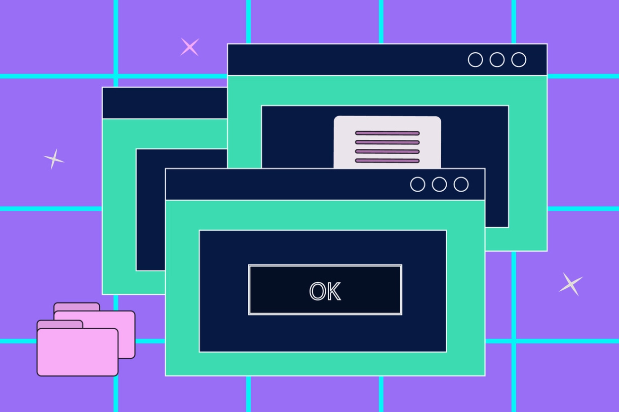
There’s Way too Many Pop-Up Features
This UX design mistake is probably the quickest way to overwhelm users, too, as they are constantly interrupted by pop-ups asking you to either subscribe, take a survey, or check out a new feature. It’s incredibly disruptive and not very pleasant!
When pop-ups appear too frequently, they can quite literally block the content users are trying to engage with. This creates a frustrating experience, as users have to close these pop-ups, navigating around them repeatedly, or worse – not being able to close them so they simply leave the site instead.
If these pop-ups are difficult to dismiss, it’ll add another layer of irritation. Users might struggle to find the tiny ‘x’ button or deal with pop-ups that require multiple steps to close. This not only wastes their time but also makes them more likely to leave the site or app altogether.
So, to recap, too many pop-ups clutter the user interface and interrupt the flow of interaction, leading to a poor user experience. Instead of enhancing engagement, they create confusion and can drive users away, negatively impacting the overall effectiveness and perception of the site or app.
The Content Hierarchy Is Completely Non-Existent
When a website doesn’t prioritise information using a visual hierarchy, it becomes difficult for users to know where to focus their attention. Visual hierarchy involves using size, colour, and contrast to indicate the importance of different elements on the page.
For example, headings should always be larger and more prominent than the body of text to signal what the content is about. Important buttons or calls to action should stand out with a contrasting colour to draw the user’s eye. When this hierarchy isn’t clear, users can get confused, miss important information, and have a frustrating experience navigating the site.
Having a proper content hierarchy in place should always be a part of the design process, as it ensures that users can quickly and easily find the most important information without feeling overwhelmed or lost.
Your Website Isn’t Great on Mobile Devices
Last but certainly not least, in terms of importance – if your website isn’t optimised for a mobile device, it’s going to be a struggle for anyone using a smartphone or tablet to navigate web pages.
When a website isn’t mobile-friendly, users have to deal with tiny text, buttons that are hard to tap, and images that don’t resize properly. This creates a frustrating experience where users constantly pinch, zoom, rage click and swipe just to read content or click on links. It’s a hassle they shouldn’t have to deal with, and often, they simply won’t – they’ll just leave the site.
Slow loading times for mobile users are another big problem. And it actually might be one of the most common UX mistakes we see. If your site takes too long to load, users will lose patience and move on to a faster competitor. No one likes staring at a blank screen, waiting for something to happen, and research suggests that the margin for error time is very small – even just a 1-second delay reduces overall customer satisfaction!
Unresponsive design is equally problematic. If your site doesn’t automatically adjust to fit different devices and screen sizes, users are left with a messy interface that’s hard to use. This not only makes your site look outdated but also drives users away, so making sure you have a responsive design is essential.
Need Help With Your SEO and Website Design? Get in Touch Today
We hope you’ve found our article on common UX mistakes useful. And if it’s made you aware of some errors on your site – don’t worry! Everything we’ve covered in this article is fixable.
If you need help ensuring that your website avoids common UX design mistakes, get in touch today.
Posted on Friday, May 17th, 2024 in Latest News.


